Welcome to Part 2 of the Labeling segment in our Hobby to Business Series. Ideally, you have now either conjured or created a vision for your logo and labels. Maybe your soap business leans more towards the holistic realm and you’ve decided to use various shades of green and brown with earthy, natural imagery and a rustic-looking font. Perhaps you are someone who prefers more simplistic design, such as a circular black & white label for your hand creme that contains nothing other than FDA required information. Or maybe you have no idea how you want your product labels to look and would like the input and assistance from a professional. No matter where you are in the labeling process, we are here to help!
How it Works
When you are ready to turn your graphics and artwork into tangible product labels, reach out to us via our handy custom quote calculator. Please note that our custom quote calculator does not generate a purchase, but serves to help us better understand your needs while also giving you a tool to determine the pricing of the labels based on the quantity you desire. Once you submit your information through the calculator, we will review your inquiry and follow up with you to further discuss your needs and address any concerns you may have. Even if you aren’t yet certain you want to invest in custom printed labels, I still recommend the tool because it is so useful in planning ahead for accounting packaging costs into your budget.
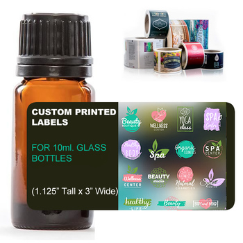
To make things easier for our customers, we offer labels that will match the specified label area for whichever jar or bottle you may have purchased from our website. These stock sizes can be found here and have the same standard dimensions as the labels that come on your Nature’s Oil products. If you are using packaging materials from another supplier, be sure to measure the bottle as not all have the same dimensions.
Once you’ve purchased labels, you will receive a confirmation email that contains an order number. This number should be attached to all correspondence, preferably from the same email address, so we can keep your dedicated file as organized as possible. One of our graphic designers will be in touch with you and at this point, you may send us your print-ready artwork. Our designers draw up a proof, show you via email, and once you approve the digital proof of the label, off to the printer it goes.
Sounds pretty easy, right? Well, it is, but only after you’ve come to learn and understand some of the industry-standard terminology used in commercial printing. There is a lot of information to take in when you are delving into an unknown realm.
Let’s face it – some of us are just not that great with technology. And that’s ok! But it’s important to remember that technology is imperative in today’s world, and especially in graphic design since we are in the digital age.Let’s discuss some of these unfamiliar terms to help us better understand the labeling process without the frustration of a bunch of foreign jargon.
Custom Printed Label Glossary
Die Cutting
Simply put, a die cutter is a mechanism used to mass produce cut-out shapes uniformly in a line. The die, which is typically made of a sharp metal, can be used to create many different shapes and sizes and can be hand or computer programmed.
Believe it or not, die cutting was initially introduced in the back in the 1800s and was utilized to create uniformly shaped shoelaces made out of strips of leather. Shoelaces that were produced by hand had many inconsistencies in shape and wouldn’t string as easily. The invention of the die cutter has been a blessing to many industries, including custom labels and printing.
Some people may have heard of or even own the Cricut® cutting machine. It brought many new innovations to scrapbooking by utilizing a die cutter. This machine happens to be one for personal use to craft at home.
File Type
The quality of your artwork depends on many factors, file type being one of the most important. Here at Bulk, we accept files in the following formats: .PSD (Photoshop Document), .PNG (Portable Network Graphic) and .PDF (Portable Document Format). Though one of the most familiar photo file types, JPEGS are not acceptable for printed material. When printing in JPEG (Joint Photographic Experts Group, who initially created the standard) format, the print quality of an image becomes compromised because it depends upon the pixel dimension (widely known as DPI or “dots per inch.”)
When you print a JPEG, what you get on the screen isn’t necessarily what you will see on paper. Most JPEGs are designed for use on the internet/computer screens, so the files are kept as small as possible. This becomes a problem when you have the image professionally printed; it will end up looking blurry and pixelated on paper compared to the image you see on your screen.
File Size
It is important that your artwork is in the correct dimensions. For instance, if an artwork is 2” x 2”, it will not translate well if your label size is 3” x 5”. The imagery and text on this label would be stretched and skewed and quite unsightly. When adjusting a file, it is important to keep the size in correct proportion.
When you are obtaining images or graphics to include in your artwork, make sure they are not infringing on copyright and especially pay mind to ensure they do not have a watermark.
DPI
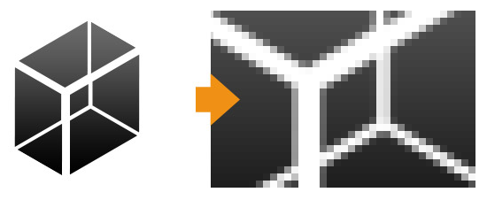
Artwork with a resolution of at least 300 DPI is needed to print clearly. Resolution lower than 300 DPI is usually associated with a lossy file format (such as JPEG) and does not always translate well from screen to print. By zooming in on the image below, we can see that there is pixelization and it may lend itself to a blurry print.
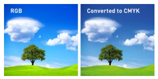
RGB/CMYK
RGB refers to the primary colors of light: Red, Green, and Blue. These are used in computer monitors, television screens, digital cameras and mobile phones. CMYK refers to the primary colors of pigment: Cyan, Magenta, Yellow, and Black and are most commonly used in printing.
There are limitations of CMYK printing and when printing both CMYK and RGB designs, they might not come out the same. This is because the CMYK colorspace does not include all the colors in the color spectrum that RGB includes. This can be seen in the images below.
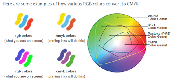
As you see, there is a slight variance when RGB colors are converted to CMYK. For this reason, we highly recommend knowing the CMYK color values of the visuals on your label so it prints as true as possible to what you see on your screen. This information is attainable through your graphic designer or your preferred design program. Keep in mind that on printed materials colors are produced differently from how they are made on a computer monitor. CMYK color values are much more dependable when working with custom printed labels.
Bleed
The bleed is an extra area outside of your label where you will extend any background colors or patterns to account for any shifting of a die cutter. The bleed’s sole purpose is to make sure your design or image reaches the very edge of the label without leaving any white edges. Be sure to keep any words or images away from the edge of your label to avoid them being trimmed off.
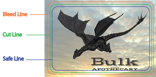
Cut Line
The cut line is exactly what it sounds like: it is the place where your label will be cut out with a die. In other words, it’s the exact size of your label. If your label is 2” x 2”, the cut line will be the same. This is the actual size of your label.
Safe Zone
The safe line is simply a visual guide within the cut line that is meant to keep all text and images from getting trimmed off by the die machine. While extremely precise, due to the nature of machinery there can be a slight variance
Matte Finish
Labels with a matte finish offer a simple, subtle elegance. Since the material has no glare, it makes it easier to read the label text and does not take away from your product’s look. These labels are also ideal for product photography due to the smooth, matte finish that won’t reflect light. Matte labels are widely preferred in the bath & body industry because they offer a more natural look without an artificial sheen to them.
Gloss Finish
Labels with a gloss finish are also a great option. They are vibrant and eye-catching. Think about printing a family photo on your home computer vs. your local drug store. Which version appears more lively? Adding a gloss finish to your labels will make the colors appear more intensely. These are great options for jars and bottles because they too are shiny surfaces.
Run
A print run refers to the process of printing multiple copies of an item at the same time. In this case, that would be your labels!
Lead Time
You will find that most printing companies will offer you a lead time for your project. Lead time is generally categorized as the time from proof approval to printing. By having your artwork print-ready at the time of your order, we are able to move forward with your project more efficiently. Note that industry-wide, lead times do not include weekends or holidays.
A Closer Look
Why are these terms so important? Here are a couple sample label artworks that are perfect examples of why these items are so pertinent to creating a professional looking label.
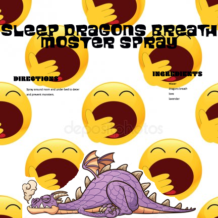
Even though it’s cute, there is still some work to be done here. The resolution is in 76 DPI. Do you see how there aren’t many crisp lines in this artwork? That is due to poor resolution. This artwork does not have the necessary ⅛” bleed which leaves the dragon’s feet and product name text susceptible to falling outside the cut line. As far as design, we can easily tell the dragon image has been cut & pasted on top of a watermarked background image. Not only that, but check out the font color and size – the text is difficult to read due to its tiny size and it also does not take up much space on the label. There are plenty of white areas that could be utilized here. Last but not least, the color of the text is illegible when placed upon certain areas of the label background.
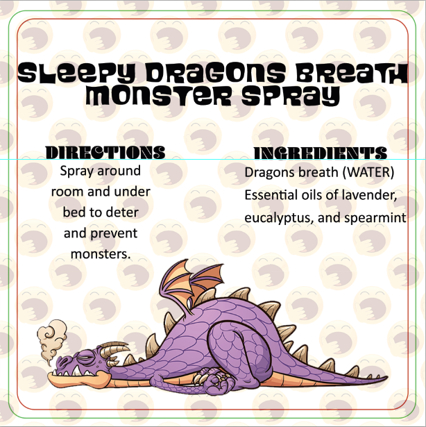
The background is extended past the green cut line with the necessary ⅛” bleed to ensure the background doesn’t get cut off and cause any unsightly white lines. The text and imagery are kept in the safe zone as shown by the red line. The background photo has been obtained legally (there’s no watermark) and its transparency has been muted to allow the purple dragon image to really pop. The ingredients and instructions are listed in a larger, easier to read text with a clear font. The font sizes are in descending order beginning with the product name down to the ingredients.
Time to Get Creative
Ready get to work? If you don’t own Adobe Photoshop or Adobe Illustrator, two of our favorite free, online design programs are Canva and Gimp. Both of these are intuitive and user-friendly. There are tutorials available as well as premade designs you can customize. Canva even has a handy mobile app where you can design straight from your phone or tablet. We can also design this label for you, and it requires a custom design fee of $60 an hour with a 1-hour minimum. This is typically sufficient time to complete a custom design project. Lead times for printing custom design work may vary.
What is your favorite photo editing software? What do your product labels look like? Head on over to our Facebook page and drop us a photo – we’d love to see!

I need help with slider tins label. Do you print them? I have no computer or printer yet. I just want a simple vintage feel.
Yes, we can designs and print the label for you; please email us your exact requirements at graphics@bulkapothecary.com